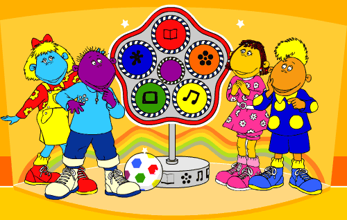
The graphic style used for this is modernism, as modernism is known for bright primary colors and abstract shapes. Also having popart as a style because it's cartoony.
Tweenies
The image above is of the children's television show, Tweenies.
The main image used is the, Tweenie Clock, because its located in the middle. Tweenie Clock is a pentagon shape with five circular lights including:
- News time
- Messy time
- Song time
- Telly time
- Story time
There's an additional 6th light called "Surprise time", placed in the middle of the other five lights. This light is a special light, although the only way to use the Surprise time is when all five lights glow. The Clock is pressed to select the activity that will be occurring next, that the Tweenies will be doing which is activities fulled of fun, laughter and learning.
Another image apart from the Tweenie Clock included is the Tweenies (the four main characters). All the characters are displayed in high prime contrasted colors, which indicated that the show is fun, adventurous enjoyable, entertaining and a way to express childrens creative side. Also the way the colors are used is to make children feel welcomed and involved which both orange and red projects, for as orange represent energy that children would need to interact with the characters and red indicating warmth that children would need to relate to the characters, as the four characters are created with different personalities.
Even though cartoons can be for all ages.
The targeted audience for this is 2-5yo, because that is the time-frame of the characters age and also because the programme is a cartoon show with bright colorful colors.
---------------

The graphic style for this is corporate graphics. Corporate design is clean, professional and simple because this make website accessible and easy to navigate through, without confusing browsers. Unlike, say if a website had a grunge style layout browsers may find it difficult to follow through.
https://twitter.com/login

The targeted audience is for 13yo and above, at least that is what it should of been...

The graphic style used in this is optical art as you can see by looking at the ride's logo below. Optical art is geometrical shapes used with limited colors, this can be a range of up to 3 shapes.
Another style this could fit in with is popart because it is cartoony.
http://www.altontowers.com/rides-and-attractions/thrill-rides/the-smiler/

The targeted audience for this is 2-5yo, because that is the time-frame of the characters age and also because the programme is a cartoon show with bright colorful colors.
---------------

The graphic style for this is corporate graphics. Corporate design is clean, professional and simple because this make website accessible and easy to navigate through, without confusing browsers. Unlike, say if a website had a grunge style layout browsers may find it difficult to follow through.
https://twitter.com/login
Twitter
The image above is of the social-networking site, Twitter.
The main image used is the blue bird (located around top left), because its the only logo/image based on the website.
The main image used is the blue bird (located around top left), because its the only logo/image based on the website.
Blue bird represent the 'Twit' in Twitter because birds make
a tweeting sound. This is why when you make a post, it's called tweeting.
Twitters website has a Black, Blue and White color scheme. Not
only because Blue and White projects purity, peace and trust, giving that
welcoming touch, these two colors also represents the sky linking with the
websites logo, the bird. The black doesn't really represent anything for the
website as it's only used for text, although in a way in it'd seem it was used
the keep the website simple. E.g having purple text may not give the website
that purity and link with the bird in the sky. On the website there's
a heading that says 'Sign in to Twitter' in Black bold text (which is the only
text in bold). This make users or anyone visiting the site for the first time
quickly draw attention to that sector.
On the website there's a
heading that says 'Sign in to Twitter' in Black bold text (which is the only
text in bold). This make users or anyone visiting the site for the first time
quickly draw attention to that sector.

...click the link below for more information.
---------------

The graphic style used in this is optical art as you can see by looking at the ride's logo below. Optical art is geometrical shapes used with limited colors, this can be a range of up to 3 shapes.
Another style this could fit in with is popart because it is cartoony.
http://www.altontowers.com/rides-and-attractions/thrill-rides/the-smiler/
Alton Towers
The image above is of
Alton Towers theme park and resorts trailer for their new ride The Smiler.
The main image used is the logo for the ride which is below.
The main image used is the logo for the ride which is below.
As you can see the smiley faces' eyes is in a hypnotic illusion pattern, this is to
indicate that the ride has a relating background to a person's mind.
With Black, Yellow and White as the color scheme is gives
that dangerous feeling.
In this form of image the Black comes across as secretive and also that there's mystery involved. This is why the Yellow works perfectly with Black background, the Yellow represents the color of the mind. Which is relevant to the ride because it is based on the mind. Not forgetting the White in the smiley face indicates that it's not only used for teeth's but that the ride mostly consent rate on your eyes being as the Yellow is mixed in with the eyes.
In this form of image the Black comes across as secretive and also that there's mystery involved. This is why the Yellow works perfectly with Black background, the Yellow represents the color of the mind. Which is relevant to the ride because it is based on the mind. Not forgetting the White in the smiley face indicates that it's not only used for teeth's but that the ride mostly consent rate on your eyes being as the Yellow is mixed in with the eyes.
The Smiler text is in a bold structure making it stand out
for that look that the ride is serious and it's not a average ride where it's
simply that you can relax.
For The Smiler there isn't exactly a targeted audience,
although you could say it's directed at people that enjoys really thrilled and
mystery rides. As the ride doesn't have a age restriction, there is a height
limit. You must be 1.4m to ride.
No comments:
Post a Comment